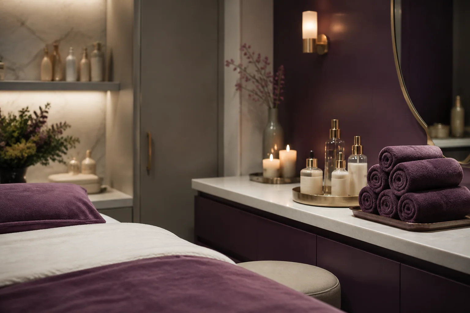
«I can take some time for myself and choose a treatment at my own pace.»
Who it is for People exploring beauty treatments who want to book an appointment.
A design intention, not a promise This is the intention behind the design. Perception also depends on the audience, content, and service. It is not a result measured through testing or market research.
02 / CHOOSING THE COLORS
More than a palette. A clear message.
For each color: its inspiration, the impression we want to create, and its role in the interface.
Soft pink
#F3E6E4
Why we chose it
It draws on the soft tones in the photography and sets the stage for the editorial content.
What we want to communicate
Warmth and gentleness.
Where it is used
The light background of the introduction and navigation.
Plum
#59334A
Why we chose it
It adds depth to the pink and makes the identity more distinctive.
What we want to communicate
Care and character, without feeling childish.
Where it is used
Headings and actions on the light background.
Eggplant
#301C2A
Why we chose it
It creates an intimate backdrop for the treatments.
What we want to communicate
A more intimate setting than the introductory section.
Where it is used
The treatment area and dark surfaces.
Mauve
#CDA7BE
Why we chose it
It connects the light and dark areas with an intermediate shade.
What we want to communicate
Continuity and attention to detail.
Where it is used
Numbers and small accents on the cards.
Colors have no universal meaning and do not guarantee sales. Here, the associations are grounded in the imagery and the project's identity. Contrast, interaction states, and readability must be checked in actual use.
03 / TYPE AND IMAGERY
The tone comes through in the details, too.
Aa
Georgia + system font
Serif headings and italic details create an editorial feel. Labels, prices, and availability use a sans-serif font to keep choices clear.
The photography
The arched photograph creates a visual entrance distinct from Corto's. Treatment cards then focus attention on the service, duration, and price.
Concept imagery, not photography from a client project.04 / PAGES AND USER JOURNEY
Every page has a purpose.
The structure separates information and guides decisions. In apps, these sections represent screens or steps, not necessarily separate web addresses.
01
Home and treatments
The photography introduces the salon's atmosphere; the cards make it easy to compare treatments and move on to booking.
02
Treatment and specialist
The first screen identifies the service and the specialist before asking you to choose a time.
03
Day and time
The demo calendar is separate from the treatments so users can make one decision at a time.
04
Summary
It brings together the service, specialist, time, and price before the simulated confirmation.
05
Appointments
The summary saved in the demo lets you try editing and canceling an appointment.
The main user journey
01Explore the treatments
02Choose a service and specialist
03Choose a time
04Review the appointment
THE NEXT STEP
Want a project designed this way?
Tell us about your business and what you want to achieve. Together, we will define a starting point, with scope, timeline, and costs agreed on before work begins.