
Paper
#F8F6F0- Why we chose it
- It lets ceramic textures and product colors stand out.
- What we want to communicate
- A bright presentation with the feel of a carefully curated catalog.
- Where it is used
- The main background.
A Kreluna concept · not client work
An imaginary home goods store. Lifestyle photography and informative product cards work together to tell the story of each object's shape, materials, and use.
Why these colors and this structure? Explore the projects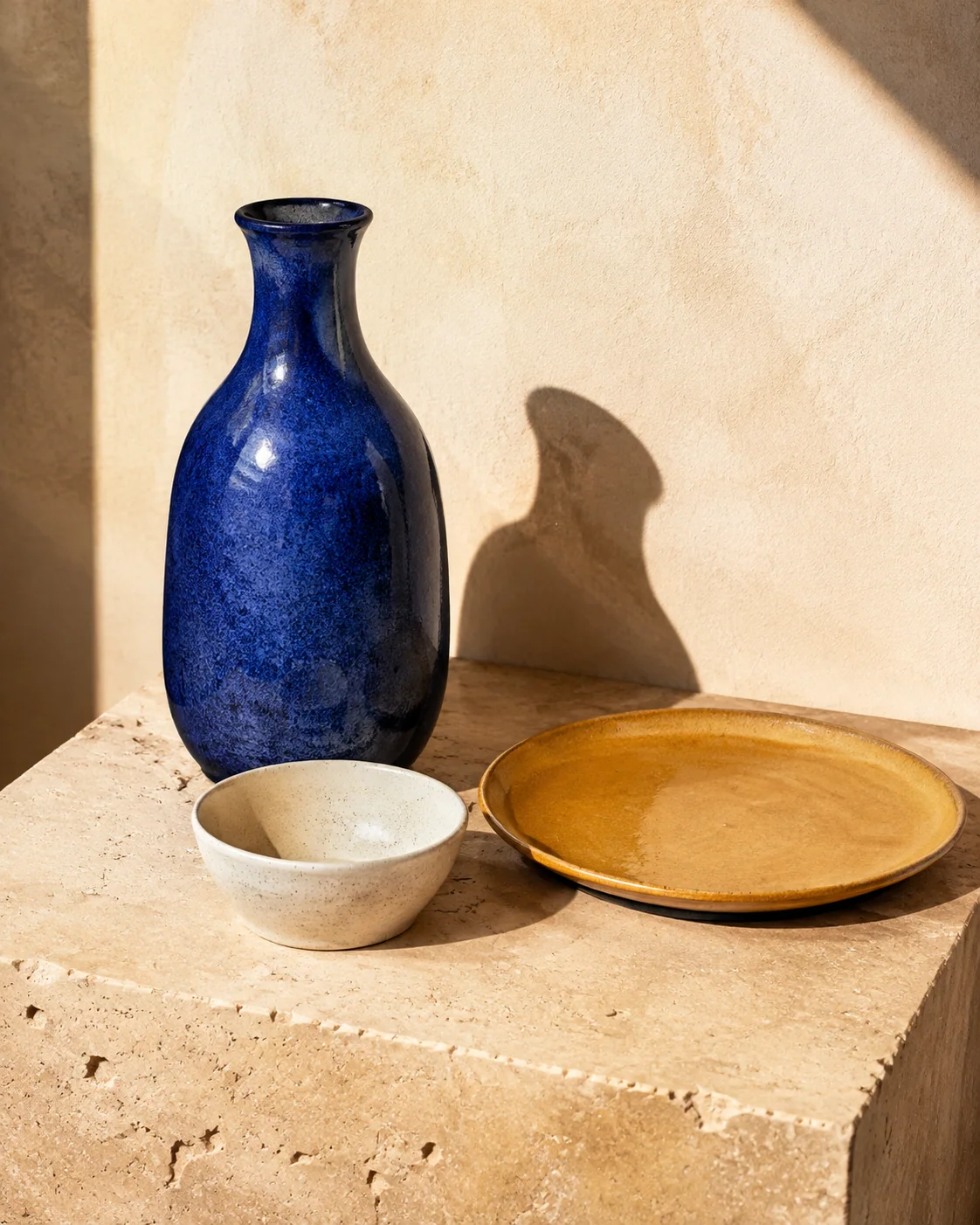
«This feels like a carefully chosen collection. I can appreciate each object and understand its features.»
Who it is for
People looking for home goods who want to assess their style, materials, and dimensions.
A design intention, not a promise
This is the intention behind the design. Perception also depends on the audience, content, and service. It is not a result measured through testing or market research.
For each color: its inspiration, the impression we want to create, and its role in the interface.
#F8F6F0#2544D3#222621#E9ECDDColors have no universal meaning and do not guarantee sales. Here, the associations are grounded in the imagery and the project's identity. Contrast, interaction states, and readability must be checked in actual use.
Large introductory sans-serif headings create a contemporary presence. Georgia adds an editorial note to object names and details.
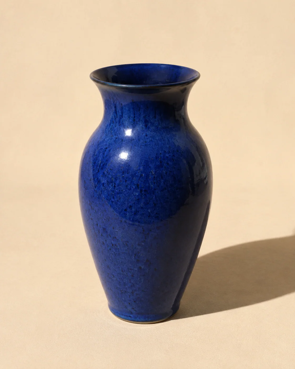
Lifestyle scenes show how objects fit into a space; isolated images make comparison easier. Not every page needs to use photographs at the same scale.
The structure separates information and guides decisions. In apps, these sections represent screens or steps, not necessarily separate web addresses.
The setting and selected objects provide an introduction and a direct route to the collection.
It brings the objects together so visitors can explore the selection with names and prices in view.
Each product page shows an image, description, material, dimensions, and finish. Quantity selection and inquiries are simulated.
It adds context to the store's identity beyond individual products.
A separate path for questions and inquiries. The demo form does not send messages.
It makes clear that the products, prices, and actions are for demonstration purposes.
Tell us about your business and what you want to achieve. Together, we will define a starting point, with scope, timeline, and costs agreed on before work begins.