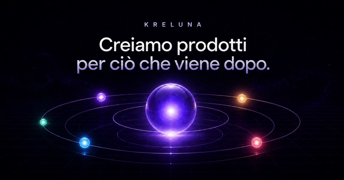
The company website www.kreluna.it presents the Kreluna ecosystem, projects in development, and the approach used to apply software, automation, and artificial intelligence to practical needs.
Screenshot of the real in-house project, published at www.kreluna.it.
THE IMPRESSION WE WANT TO CREATE
«I can understand who Kreluna is, what it is building, and how it approaches a digital project.»
Who it is for Businesses and professionals interested in software, automation, artificial intelligence, and digital projects.
A design intention, not a promise This is the intention behind the design. Perception also depends on the audience, content, and service. It is not a result measured through testing or market research.
02 / CHOOSING THE COLORS
More than a palette. A clear message.
For each color: its inspiration, the impression we want to create, and its role in the interface.
Cosmic black
#080910
Why we chose it
It is the actual background of the company website, allowing light, grids, and content to stand out.
What we want to communicate
Technology, depth, and focus.
Where it is used
The main background, header, and storytelling sections.
Kreluna purple
#A996FF
Why we chose it
It is the signature color seen in the site's logo, headings, and actions.
What we want to communicate
Digital creativity and a distinctive identity.
Where it is used
Highlighted headings, buttons, and glows.
Moon white
#F5F3FF
Why we chose it
It creates maximum contrast on the dark background while retaining the identity's soft tone.
What we want to communicate
Clarity and authority.
Where it is used
Main headings and essential information.
Lavender
#B9B0D6
Why we chose it
It keeps secondary text readable and visually connects it to the main purple.
What we want to communicate
Balance and continuity.
Where it is used
Navigation, paragraphs, and supporting information.
Colors have no universal meaning and do not guarantee sales. Here, the associations are grounded in the imagery and the project's identity. Contrast, interaction states, and readability must be checked in actual use.
03 / TYPE AND IMAGERY
The tone comes through in the details, too.
Aa
Contemporary sans-serif type with an editorial italic accent
The clean typeface makes the message immediate; the large purple italic in “Projects taking shape” adds personality and movement to the page.
The photography
The image uses the actual visual identity of www.kreluna.it: a dark background, glowing orbits, and purple accents introduce the ecosystem of Kreluna projects.
Visual material from the real Kreluna.it in-house project.04 / PAGES AND USER JOURNEY
Every page has a purpose.
The structure separates information and guides decisions. In apps, these sections represent screens or steps, not necessarily separate web addresses.
01
Home and introduction
Useful technology and projects taking shape: the opening introduces Kreluna's identity and ecosystem.
02
Projects
It presents the ecosystem's projects, distinguishing their identities and stages of development.
03
What we do
It explains how software, automation, and artificial intelligence can address practical needs for businesses and professionals.
04
CityBeam and Cosmora
They give individual projects their own space, with a dedicated visual identity and presentation.
05
Company
It introduces Kreluna, the direction of its work, and company information.
06
Approach and contact
The approach and contact links help visitors move from discovering the ecosystem to an initial discussion about their project.
07
Resources
Insights into AI and automation complement the introduction to the company and its projects.
The main user journey
01Get to know Kreluna
02Explore the projects
03Understand the approach
04Contact the studio
THE NEXT STEP
Want a project designed this way?
Tell us about your business and what you want to achieve. Together, we will define a starting point, with scope, timeline, and costs agreed on before work begins.