
Mineral white
#F7F7F2- Why we chose it
- It echoes light walls and architectural surfaces.
- What we want to communicate
- Breathing room and restraint.
- Where it is used
- Page backgrounds.
A Kreluna concept · not client work
An imaginary studio presented through projects and images. The interface stays understated so it does not compete with space, light, and materials.
Why these colors and this structure? Explore the projects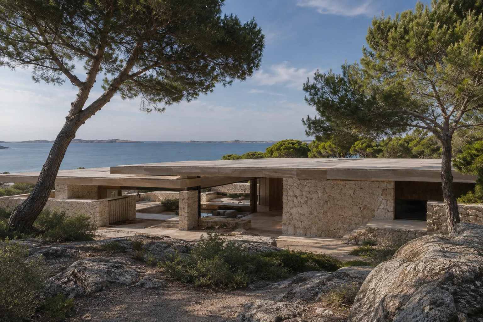
«This studio has a clear design language. I can look at its projects and understand how it works.»
Who it is for
People looking for a studio who want to explore its design sensibility, projects, and services.
A design intention, not a promise
This is the intention behind the design. Perception also depends on the audience, content, and service. It is not a result measured through testing or market research.
For each color: its inspiration, the impression we want to create, and its role in the interface.
#F7F7F2#283029#35473A#67745FColors have no universal meaning and do not guarantee sales. Here, the associations are grounded in the imagery and the project's identity. Contrast, interaction states, and readability must be checked in actual use.
Georgia brings an editorial tone to project headings. Labels, navigation, and metadata remain understated so the typography does not compete with the images.
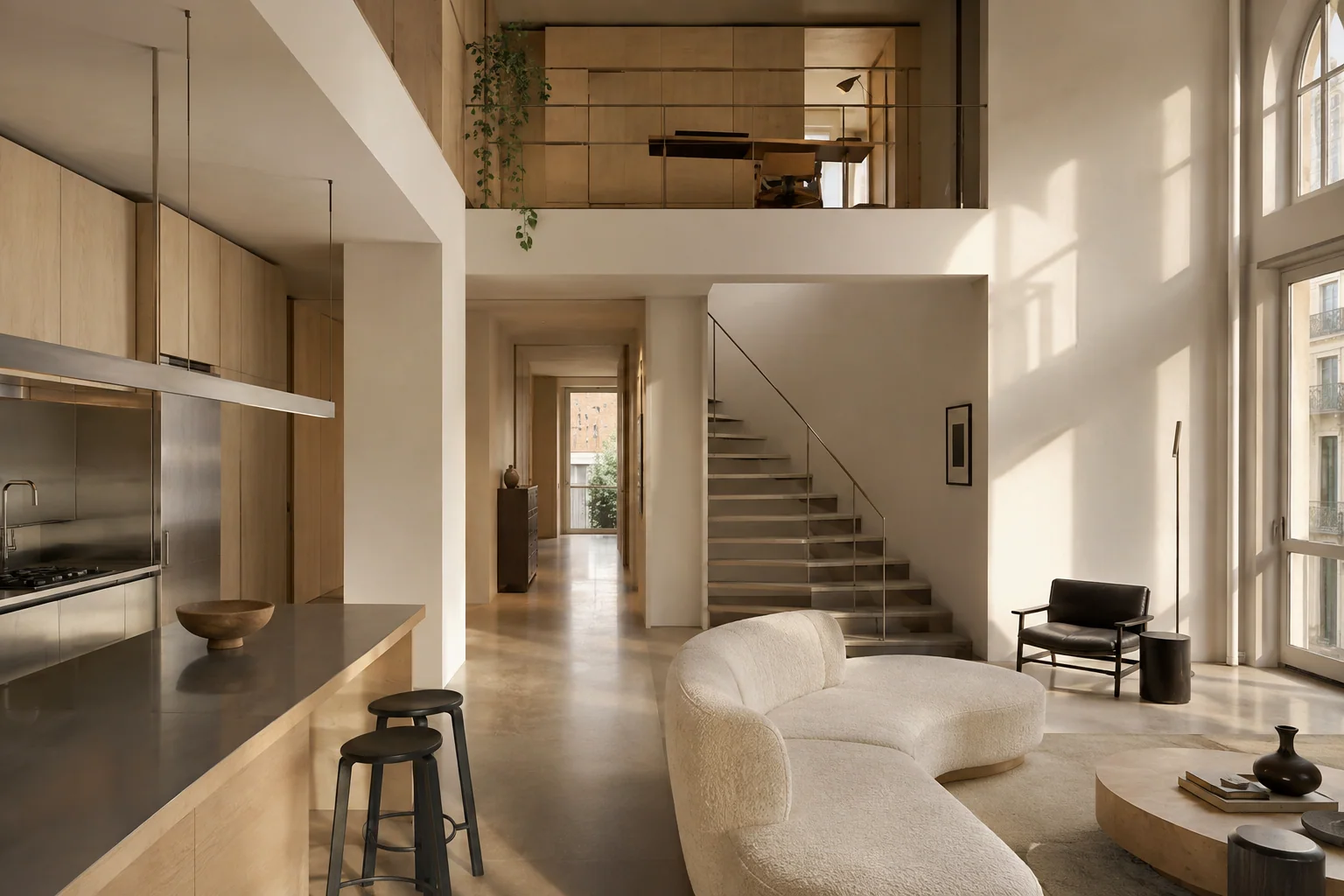
Large photographs open the story; the grid makes projects easy to compare. Dedicated project pages give space to light, interiors, and the relationship with the landscape.
The structure separates information and guides decisions. In apps, these sections represent screens or steps, not necessarily separate web addresses.
A featured project and a selection of work introduce the studio's design language.
The grid lets visitors compare three projects and choose which to explore.
Each page presents a distinct project, with its own story and images.
It presents the imaginary studio's identity and approach.
It defines the areas of practice, keeping them separate from the portfolio.
It guides visitors toward an initial conversation; the form is a local simulation.
It distinguishes demo projects from real commissions and completed work.
Tell us about your business and what you want to achieve. Together, we will define a starting point, with scope, timeline, and costs agreed on before work begins.