
Warm ivory
#FAF5EE- Why we chose it
- It gives the garments' colors and textures room to stand out.
- What we want to communicate
- A bright, carefully considered presentation.
- Where it is used
- The catalog and product page backgrounds.
A Kreluna concept · not client work
A women's fashion concept with an editorial approach: showcasing dresses, tailoring, and lingerie while keeping prices, sizes, and the shopping journey clear.
Why these colors and this structure? Explore the projects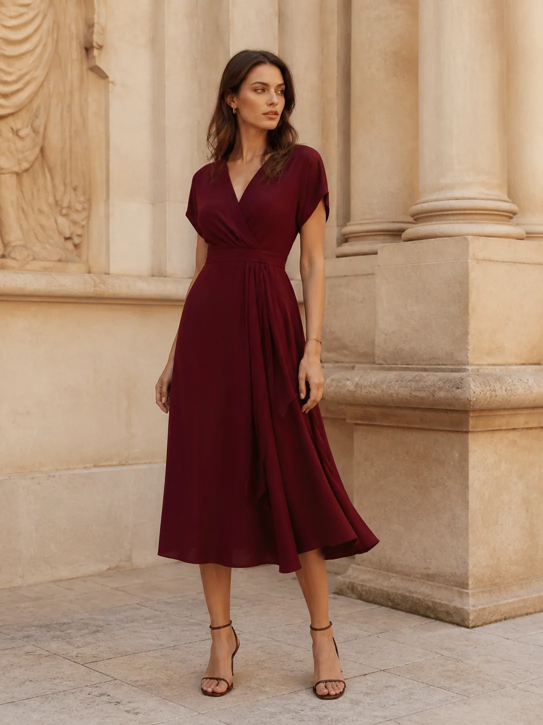
«This selection has a distinct style. I can look through the pieces and choose thoughtfully.»
Who it is for
People interested in a curated selection of women's clothing and a guided shopping experience.
A design intention, not a promise
This is the intention behind the design. Perception also depends on the audience, content, and service. It is not a result measured through testing or market research.
For each color: its inspiration, the impression we want to create, and its role in the interface.
#FAF5EE#772F40#39272B#EEE3DCColors have no universal meaning and do not guarantee sales. Here, the associations are grounded in the imagery and the project's identity. Contrast, interaction states, and readability must be checked in actual use.
Serif type gives the headings a magazine-like character. Prices, sizes, filters, and the cart use a practical sans-serif font.
Large, aligned photographs showcase the garments. The opening campaign introduces the style; the grid and details allow for a more concrete comparison.
The structure separates information and guides decisions. In apps, these sections represent screens or steps, not necessarily separate web addresses.
The campaign introduces the identity; filters and the grid move visitors from inspiration to selection.
Photos, description, price, and size bring together the information needed before adding an item.
They let users set aside pieces to revisit without confusing them with items ready to purchase.
Quantities and totals make the selection visible.
It completes the journey with a summary, without real charges or shipments.
Tell us about your business and what you want to achieve. Together, we will define a starting point, with scope, timeline, and costs agreed on before work begins.