
Purple night
#0E0C15- Why we chose it
- It creates a backdrop consistent with the lighting in the product images.
- What we want to communicate
- Immersion and the feel of a digital universe.
- Where it is used
- The store background.
A Kreluna concept · not client work
An imaginary store for figures and gaming products. A dark setting and bright accents highlight the products while keeping the shopping journey clear.
Why these colors and this structure? Explore the projects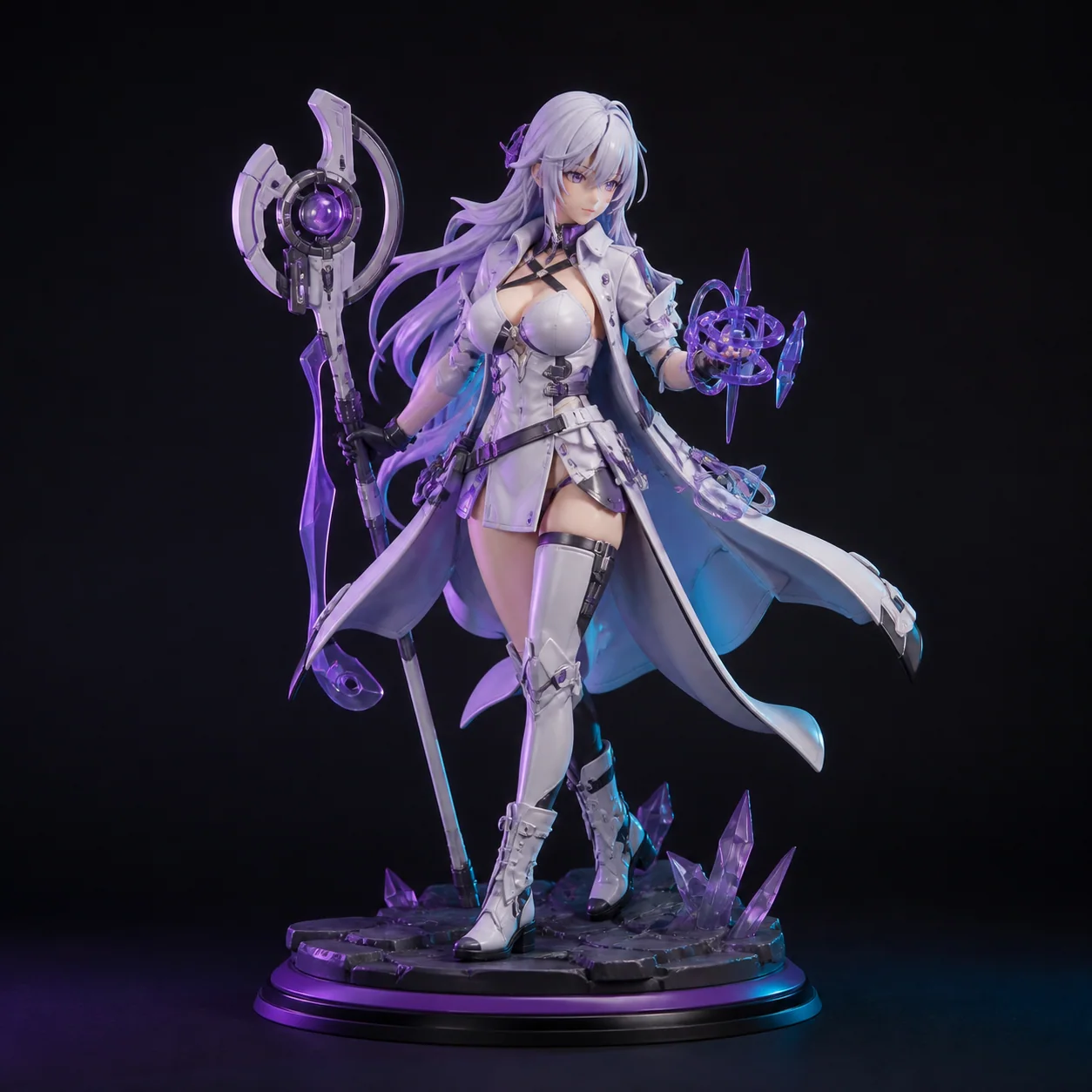
«This store speaks my language. I can explore and compare the things that interest me.»
Who it is for
Fans of figures, collectibles, and gaming accessories.
A design intention, not a promise
This is the intention behind the design. Perception also depends on the audience, content, and service. It is not a result measured through testing or market research.
For each color: its inspiration, the impression we want to create, and its role in the interface.
#0E0C15#BF9AFF#F5EFFF#30213EColors have no universal meaning and do not guarantee sales. Here, the associations are grounded in the imagery and the project's identity. Contrast, interaction states, and readability must be checked in actual use.
Large, compact headings give the store energy. Product cards remain easy to read so the catalog does not become one big promotional image.
The figure in the opening immediately establishes the category. Product images guide exploration, while categories, product pages, and prices support decisions.
The structure separates information and guides decisions. In apps, these sections represent screens or steps, not necessarily separate web addresses.
The featured item introduces the store; categories help narrow the selection.
Details and price support the decision to add an item to the cart.
Quantities and totals make the selection easy to review.
The summary completes the journey without real payments or orders.
Tell us about your business and what you want to achieve. Together, we will define a starting point, with scope, timeline, and costs agreed on before work begins.