
Cream
#FFFAF2- Why we chose it
- It provides a warm base and gives the food photography room to shine.
- What we want to communicate
- Warmth and simplicity.
- Where it is used
- The experience's background.
A Kreluna concept · not client work
An imaginary restaurant presented through dishes, ingredients, and separate paths for placing an order and reserving a table.
Why these colors and this structure? Explore the projects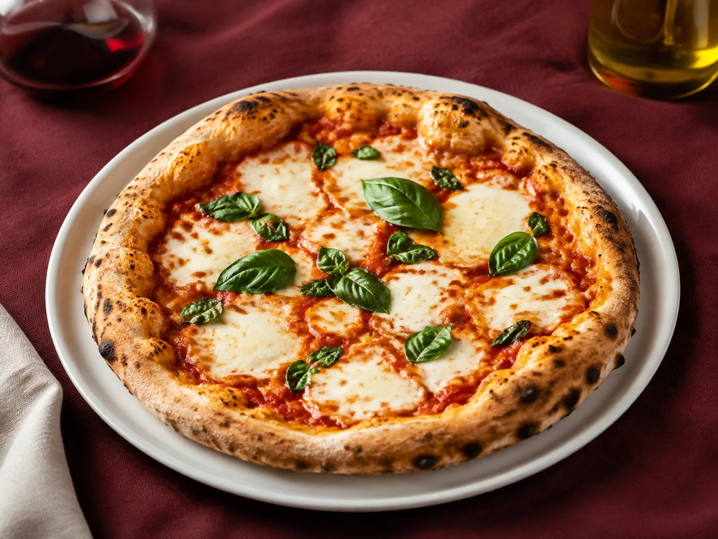
«I feel invited to explore the dishes, and I immediately know how to order or book.»
Who it is for
People browsing a menu, putting together an order, or looking for a table.
A design intention, not a promise
This is the intention behind the design. Perception also depends on the audience, content, and service. It is not a result measured through testing or market research.
For each color: its inspiration, the impression we want to create, and its role in the interface.
#FFFAF2#731D30#362125#F0E0D7Colors have no universal meaning and do not guarantee sales. Here, the associations are grounded in the imagery and the project's identity. Contrast, interaction states, and readability must be checked in actual use.
Georgia gives the headings and brand the feel of a thoughtfully designed menu. Arial supports ingredients, prices, quantities, and controls, where practical readability matters.
Food photographs are large and close to their descriptions. The featured dish provides a starting point, while categories and cards keep the menu from being just a gallery.
The structure separates information and guides decisions. In apps, these sections represent screens or steps, not necessarily separate web addresses.
Categories and dishes with photos, descriptions, and prices help visitors decide what to order.
Information and available options are brought together before a dish is added to the order.
Quantities and totals let users review the order before the simulated confirmation.
The reservation flow is separate from ordering: party size, day, and time address a different need.
Demo confirmations make the selections clear without sending requests to the restaurant.
Tell us about your business and what you want to achieve. Together, we will define a starting point, with scope, timeline, and costs agreed on before work begins.